1. The Structure Principle
Definition: The interface is well organized into different categories. User can easily distinguish the difference between each item.
Techniques
-Align fields effectively
-Word your messages and labels effectively
-Follow the contrast rules.
Figure1.1
URL: https://blogger.googleusercontent.com/img/b/R29vZ2xl/AVvXsEiHBbgX8pdCoExqkAnSSl5m3b3kO9w-VgTqPmKvN6cpjdw-0zC3YSCz8BNlONhNG-2SAneKXpujhfIjUmC-ynInu3H8Gff-ZaqIlX8YmyXwaoPZcJUTxoxjNj4N9quP0rwJkjaC3mR0Ywk/s1600/3g-iphone.jpg
iPhone is one of the sucessful mobile product, because it has meet the structure principle.
As we can see, different items are already organized into different categories; the items are in columns and rows, instead of over-lapping each other. It is a very easy understand UI; also the icons has its understand icon and text labeled. The background color is black which contrasts the icon colors, makes the icon really stand out and easy to focus on what item to select.
2. The Simplicity Principle
Definition: It is very straight forward, how can user understand the UI in the shortest amount of time. If encounter similar task, is it still easy to handle.
Techniques
- Navigation between major user interface items is important:
- Navigation within in a screen is important
- Understand the UI widgets
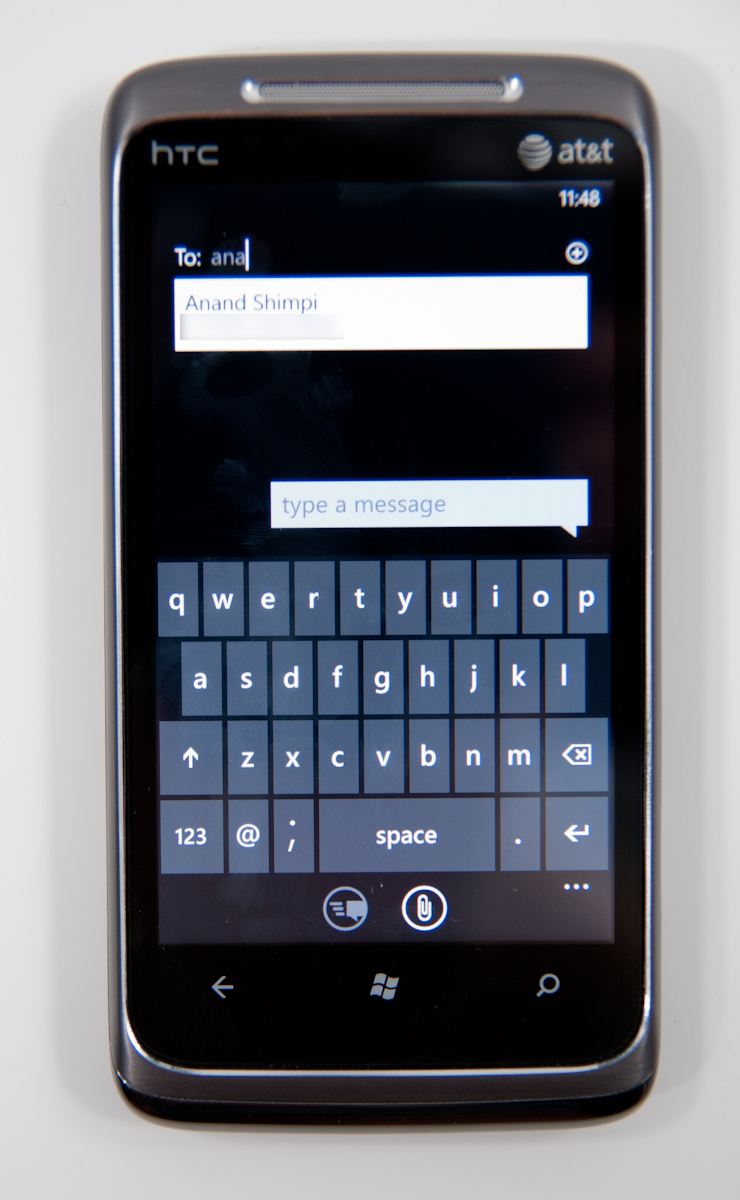
Figure 1.2
URL: http://images.anandtech.com/doci/3982/HTCSurround--3.jpg
Again, this is is very simple interface. The user can understand it very clearly. There were two types of entering messages. First is the traditional way, which 1 = a,b,c, 2 = d,e,f...etc; and if the phone didn't understand your word correctly, you would have to either press it again or enter into a different screen to select your word. Second is the modern way, which provides us with what we (the computer users) use almost everyday, the keyboard. Now, everything is very consistent with its design and can be done in one screen.
3. The Visibility Principle
Definition: Items that is shown should be easy to read and understand; everything should be kept simple, user shouldn't be overwhelmed or distracted with the information load.
Techniques
-Consistency
-Set standard
-Explain the rules
Figure 1.3
URL: http://download.autodesk.com/us/fbx/fbx_maya_online/images/MED/FBX/Ozzy-Maya-PLG/English/FBXUI_Off.png
This UI design is very simple and effective. When the screen pops out, we see warning which informs users this is something serious. Information provided is very straight forward; there is no futher explaination of what might happen to other application, just a very simple info and a question asked. It is kept in two option, yes and no, there is no maybe or disable for certain amount of time or time line or would you like to disable more or...etc.
4. Feedback Principle
Definition: Inform user the out-come of his/her action. Interface is kept easy, simple and understandable.
Techniques
-Look at other applications with a grain of salt
-Explain the rules
-World your message and label effectively
Figure1.4
URL: http://www.devexpress.com/Subscriptions/DXperience/WhatsNew2010v2/i/Video-Screenshot-InstantFeedback.png
The feedback of this UI is very clearly presented with a large amount of data that the user have. It has shown the # count and total size for each items. Everything is clearly labeled. Each column and row explains well of what is going on in the interface.
5. The Tolerance Principle
Definition: The error is fixable if the user have made a mistake also reduce the chance of making mistake within the interface.
Technique
-Expect your user to make mistake
-Your design should be intuitable
-Explain Rules
Figure1.5
URL: http://regmedia.co.uk/2009/04/21/vmware2.jpg
"Automated fault tolerance had first been demoed by VMware two years ago as a proof of concept," "an employee impersonating a Secret Service agent - it's Obama's BlackBerry, remember - simply unplugged the blade upon which the source VM was running and pulled it out of its rack. Without missing a beat that anyone in the hall could detect, the cloned VM took up immediately where the source VM had left off."
This is an example of preventing user to make mistake with an employee trying on his own. The idea of "automated fault tolerance" has been introduced to the world.
Quotes from: http://www.theregister.co.uk/2009/04/21/vsphere_introduction/
6. Reuse Principle
Definition: Identical usage of the component or procedure experienced by user, preventing the chance of confusion.
-Consistency
-Set standard
-Don't create busy user interface
Figure 1.6
URL: http://www-bgr-com.vimg.net/wp-content/uploads/2011/04/win-8-tile-ui110401123634.jpg
This kind of design of UI has make the folder icon all the same, which won't confuse the user of what the object is. Everything is kept in order and consistant of what's going on. There is no massive information presented except the basic folder names. It would be very hard for the user to make mistake on this kind of interface.


No comments:
Post a Comment