Tuesday, 28 June 2011

DMA188_UI_Research Project


1. The Structure Principle
Definition: The interface is well organized into different categories. User can easily distinguish the difference between each item.
Techniques
-Align fields effectively
-Word your messages and labels effectively
-Follow the contrast rules.
Figure1.1
URL: https://blogger.googleusercontent.com/img/b/R29vZ2xl/AVvXsEiHBbgX8pdCoExqkAnSSl5m3b3kO9w-VgTqPmKvN6cpjdw-0zC3YSCz8BNlONhNG-2SAneKXpujhfIjUmC-ynInu3H8Gff-ZaqIlX8YmyXwaoPZcJUTxoxjNj4N9quP0rwJkjaC3mR0Ywk/s1600/3g-iphone.jpg
iPhone is one of the sucessful mobile product, because it has meet the structure principle.
As we can see, different items are already organized into different categories; the items are in columns and rows, instead of over-lapping each other. It is a very easy understand UI; also the icons has its understand icon and text labeled. The background color is black which contrasts the icon colors, makes the icon really stand out and easy to focus on what item to select. 

2. The Simplicity Principle
Definition: It is very straight forward, how can user understand the UI in the shortest amount of time. If encounter similar task, is it still easy to handle.
Techniques
- Navigation between major user interface items is important:
- Navigation within in a screen is important
- Understand the UI widgets
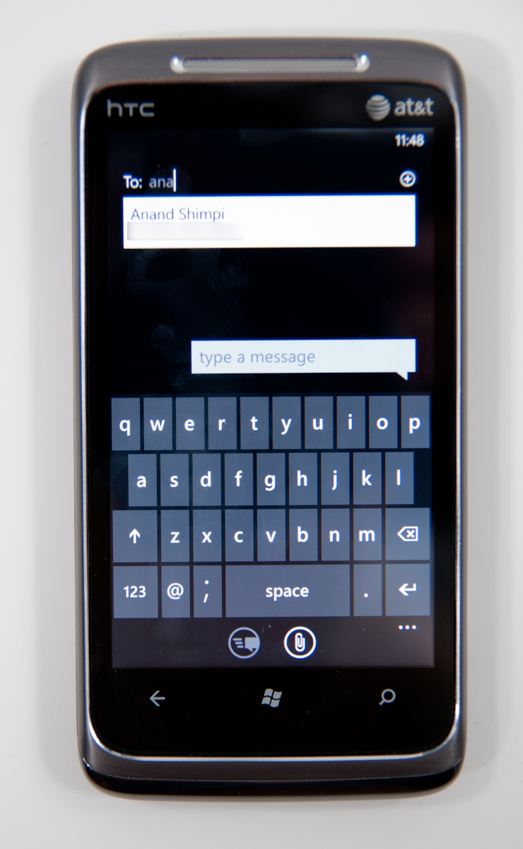
Figure 1.2
URL: http://images.anandtech.com/doci/3982/HTCSurround--3.jpg

Again, this is is very simple interface. The user can understand it very clearly. There were two types of entering messages. First is the traditional way, which 1 = a,b,c, 2 = d,e,f...etc; and if the phone didn't understand your word correctly, you would have to either press it again or enter into a different screen to select your word. Second is the modern way, which provides us with what we (the computer users) use almost everyday, the keyboard. Now, everything is very consistent with its design and can be done in one screen. 

3. The Visibility Principle
Definition: Items that is shown should be easy to read and understand; everything should be kept simple, user shouldn't be overwhelmed or distracted with the information load.
Techniques
-Consistency
-Set standard
-Explain the rules

Figure 1.3
URL: http://download.autodesk.com/us/fbx/fbx_maya_online/images/MED/FBX/Ozzy-Maya-PLG/English/FBXUI_Off.png

This UI design is very simple and effective. When the screen pops out, we see warning which informs users this is something serious. Information provided is very straight forward; there is no futher explaination of what might happen to other application, just a very simple info and a question asked. It is kept in two option, yes and no, there is no maybe or disable for certain amount of time or time line or would you like to disable more or...etc.
4. Feedback Principle
Definition: Inform user the out-come of his/her action. Interface is kept easy, simple and understandable.
Techniques
-Look at other applications with a grain of salt
-Explain the rules
-World your message and label effectively
Figure1.4
URL: http://www.devexpress.com/Subscriptions/DXperience/WhatsNew2010v2/i/Video-Screenshot-InstantFeedback.png 

The feedback of this UI is very clearly presented with a large amount of data that the user have. It has shown the # count and total size for each items. Everything is clearly labeled. Each column and row explains well of what is going on in the interface.  


5. The Tolerance Principle
Definition: The error is fixable if the user have made a mistake also reduce the chance of making mistake within the interface.
Technique
-Expect your user to make mistake
-Your design should be intuitable
-Explain Rules


Figure1.5
URL: http://regmedia.co.uk/2009/04/21/vmware2.jpg

"Automated fault tolerance had first been demoed by VMware two years ago as a proof of concept," "an employee impersonating a Secret Service agent - it's Obama's BlackBerry, remember - simply unplugged the blade upon which the source VM was running and pulled it out of its rack. Without missing a beat that anyone in the hall could detect, the cloned VM took up immediately where the source VM had left off."
This is an example of preventing user to make mistake with an employee trying on his own. The idea of "automated fault tolerance" has been introduced to the world. 

Quotes from: http://www.theregister.co.uk/2009/04/21/vsphere_introduction/

 
6. Reuse Principle
Definition: Identical usage of the component or procedure experienced by user, preventing the chance of confusion.
-Consistency
-Set standard
-Don't create busy user interface

Figure 1.6
URL: http://www-bgr-com.vimg.net/wp-content/uploads/2011/04/win-8-tile-ui110401123634.jpg

This kind of design of UI has make the folder icon all the same, which won't confuse the user of what the object is. Everything is kept in order and consistant of what's going on. There is no massive information presented except the basic folder names. It would be very hard for the user to make mistake on this kind of interface.

Thursday, 23 June 2011

DAM188_ResearchPaper_USB

USB has been a great achievement in human techinology. It was such a great product, when USB 2.0 published by Trek Technology and IBM, a lot of other complanies start to plagerize. USB is like a super version of mini version of a computer hard drive. Its transfering speed in data has been increasing in each updates. It has no doubt USB has benefit the majority of people for its capability of portabiilty. However, people often forget them due to its insignificant size. USB later become a popular device among people, creativity in style for USB start to flow. In 2008, USB 3.0 is born.


1. I never realize USB have such high similarity in the inner design compare to computer hard-drive. I've always thought USB is just like a chip for camera and the connector is made for convience to communicate with computers.

2. It was interesting knowing even a simple device like USB has versions from 0.7~3.0. Also the difference in speed in each different version. For me, I've always think, USB is USB, it does stroaging items, a good USB and a bad USB only have difference in capacity. Before research, I've never paid attention to USB and its speed of copying data.
3. After went on different websites, I was shocked that even a USB can be creative. I've always though USB is a rectagular stick. I stayed around the web page for a while checking out different pictures of USB.
I will be selective if I ever go purchase a USB.

DMA204_self

DMA101_Color

This is NOT my drawing, but I COLORED IT!!!


1st thing I've encountered was the multiple layers that is on this character, not to mention tracing could take a lot of time. However, I started with the hair, then I found out, the hair intersect with the ball, and the ball intersect with the hair. I had to adjust these 3 area to make it balance, took a really long time to figure out how to adjust it. There is no short cut(for me), I had to press A, and zoom in the scale and adjust point by points, since that part has like...I don't know... I think lots of points.

This is my 2nd part trouble, the HAND!!! I am lucky it's just one hand. As you can see, 3 layers, hair on top of the red-ribbons then on the hand. Because the artist did not connect the lines for the hand. After I just put layers on top of each other, IT LOOKED weird. since I got all lines traced. I figure, I don't really need to get my line accurate, since the inaccurate line will be under-neath of accurate lines. the hand was colored part by part, as you can see what's happening on the leg part. YES it takes longer time, but I find it better looking.

The facial part was hard with coloring, cause the original art work didn't specify its eye, tongue, teeth, you can see it's not clear, either the eye is one huge round color, or there is another color in there. I tried both, I find I need to create another layer for it, which the artist did not draw. Same for the mouth, the artist didn't make it well seem, either the line is a teeth or it could be the tongue, the line is even broken, I couldn't really tell, until my friends told me, I better create both tongue and teeth.  so I kind did it there, even though the artist didn't put it there.
The shadow, yes the shadow. Not the drop shadow, but the shadow, which you can see on the character, it has yellow and darker yellow on the hair, same for the flower blue and darker blue. Yeah just put the shadow, BUT WHERE?!! I had hard time selecting places for shadow, most of time, it just looks weird, either it's too long or too short too big too small. After I did the shadow, I make a drop shadow effect on it, just try to amplify my shadow effect.


This character is really time consuming. I think I probably have 200+ layers for it. I will have to find a short cut to do it.

Thursday, 16 June 2011

DMA188_reserch paper


USB


USB is one of the most populated portable drive compare to others, like floppy disk, CDs…etc. It is like iPhone games compare to wii, play-station, x-box games. It’s small portable and easy to carry.

USB1.0 is released in January 1996, it is capable of transfer data at a rate of 1.5~12mbit/s, however only a few products meet the market demand, because of the lack in essence of power and time.

As USB2.0 comes out in April 2000, USB is capable of transferring in 60MB/s, but was unable to perform such Hi-speed due to the problem that is with NAND flash. NAND flash uses “floating-gate transistors”, “Manufacturers try to maximize the amount of usable storage by shrinking the size of the transistor below the size where they can be made reliably, to the size where further reductions would increase the number of faults faster than it would increase the total storage available.”

Long story short, the year of 2000 is also when USB is starting to sell in commercials by Trek Technology and IBM. At the time, the USB only have 8MB storage which is 5 times the capacity of a flappy disk. This is one major step for USB to start dominate the portable drive market. 

Of course, there were a lot of companies got in lawsuit due to the patents, including PNY Technologies, Lenovo, Aigo, Sony and Taiwan’s Acer. Many companies start to produce USB disregarding the copy rights. USB starts to flow into the market, including the ones with bad qualities. At the time, most of the USB doesn’t have the capability of what’s written in the description.


However, USB didn’t stop here. In 2008/11/17, USB3.0 is officially promoted, which increased the transmission speed to 5Gbit/s; that is 10 times more than USB2.0(480Mbit/s). Such improvement have reduced the transferring time, and power consumption. Up to 2011 April, the version for USB still stayed in 3.0.


Now, to understand better about USB, there are parts to it.
1.      USB connector
2.      USB mass storage controller device
3.      Test points – while manufacturing, these test pins will load in codes into microprocessor
4.      Flash memory chip
5.      Crystal oscillator – a material to create an electrical signal with very precise frequency.
6.      LED
7.      Write-Protect switch(optional)
8.      Space for second flash memory chip.


USB is a commonly seem product everywhere now, school, work, business, education, maybe not film, video game yet, but the possibility in the future is very high.
USB can be used in a vest area of technology, including PC, apple, and let’s not forget about games like wii, psp, x-box…etc.
            The capability of such product is un-imaginable; people can carry 32G files with the USB size of 2 fingers, instead of carrying a whole drive.


Even as the technology has advanced so much, a touch screen or other fancy stuffs for USB is just seemed not necessary. A USB is made to be simple and easy to carry. However, artists came in and start to design different USBs for such a great invention that has brought down to us.


USB definitely have a lot of positive user experience for its convince to carry and transferring files. Back in the dark days, business people use to carry the whole lap top with them, at the time it is the most comfort they can get. There is also another way to transfer files through the internet, however, the upload can take up hours and if the net went down, the whole process terminates. USB as an individual hard drive is light and doesn’t take up much spaces, with a hand full, you can grab at least up to 10 USBs; a handful of 320G files. That’s how much capacity your hand can withhold.

However, on the downside there is also a dis-advantage for USB. Before USB become more associate with computers, users used to have install softwares to let the computer acknowledge the existence of USB and have access to it.  However, the problem is fixed as the innovation of computers keep advancing. As USB become smaller and smaller, people tend to forget to take it and left it on PC. Major files losses happen, because of carelessness.


Bibliography

Review from expert

Yan. "Google Patents." Google. US, 26 Feb. 2004. Web. 7 June 2011. <http://www.google.ca/patents?hl=en&lr=&vid=USPATAPP10223989&id=HSmeAAAAEBAJ&oi=fnd&dq=USB&printsec=abstract#v=onepage&q&f=false>.

Images

Google. Web. 9 June 2011. <http://www.google.ca/search?um=1>.

Google Image 10 June 2011 <http://www.google.ca/search?hl=en&q=carrying%20a%20PC&gs_sm=e&gs_upl=992l37285l0l22l20l3l3l3l0l196l1427l7.5&bav=on.2,or.r_gc.r_pw.&biw=1680&bih=830&um=1&ie=UTF-8&tbm=isch&source=og&sa=N&tab=wi>


Definition

"Flash Memory." Wikipedia, the Free Encyclopedia. Web. 9 June 2011. <http://en.wikipedia.org/wiki/Flash_memory>.

"Crystal Oscillator." Wikipedia, the Free Encyclopedia. Web. 9 June 2011. <http://en.wikipedia.org/wiki/Crystal_oscillator>.

History
"USB Flash Drive." Wikipedia, the Free Encyclopedia. Web. 8 June 2011. <http://en.wikipedia.org/wiki/USB_flash_drive>.

"Universal Serial Bus." Wikipedia, the Free Encyclopedia. Web. 8 June 2011. <http://en.wikipedia.org/wiki/USB_2.0>.

"USB Modules." Futurlec, The Electronic Components and Semiconductor Superstore. Web. 15 June 2011. <http://www.futurlec.com/USB.shtml>.

Wednesday, 8 June 2011

DMA100-Logo_Assignement

This is my Final work, a traced version of NOLA team logo.
The 1st problem I've encountered is the wing, since I started from the wing, and the wing is blocked by hands and body of the Bee, so I decided to put the wings at the back of the other layers, as you can see, the completed wing isn't well drawn at the hidden parts. Both wings is completed with "Path Finder".
The 2nd problem encountered was the bee body, because it is in perspective. The major part that got distorted the most is words on the bee's chest.
The major problem is the basketball part, since I can't do the old-fashion way(tracing line by line). I did the tracing at start, the whole basketball just doesn't look right. Thus, I had to use path finder, and use shape tool to create 2 circles to create the outline of the basketball.The path finder is used in the orange parts. And the lines were out of control because it's behind Bee's left hand and the wing, so I didn't care much, since it's gana be block anyways.